In the summer of 1983 Jack Applin, writing from Hewlett-Packard, asked a Usenet group how to show italics on a terminal that had none. His own answer: “I usually do it like *this*.” Capitals, he thought, were too loud. Nine months later someone started a thread titled ***Asterisks*** to say that nothing irritated him more. The habit was already common enough to be hated.
In 2004 John Gruber wrote those habits down and called the result Markdown, with a great deal of feedback from Aaron Swartz. He is plain about the source: more than anything else, the syntax came from plain-text email. The iPhone was three years away; this was a way to write for the web. And his rule was not about software at all: a page should be readable as it is, without looking like it has been marked up.
My first idea for the journal in Retrography was no formatting at all. Plain text, fully justified, with automatic hyphenation, like a page in a book. I still think that is the purest form a diary can take. Then people asked for a bold word, a list, a heading on a long day, and I wanted to give them that without giving up the plain page.
Markdown is the closest thing to plain text that still has structure. It says what a piece of text is — a heading, a list, a word that matters — and not how it should look. That is what I want from a diary: information first, decoration second. And it travels. Export an entry and open it in another app, read it in a terminal, or paste a month into an AI chat, and it still makes sense; Markdown is what those tools read and write by default anyway. Apps come and go, and a diary is supposed to outlast all of them.
Rich text is the honest alternative. It works fine on a phone, and on screen it is the nicer of the two: no marks anywhere. The question is what ends up in the file. RTF itself is a sturdy old format, frozen since 2008 and readable almost everywhere, but open one in a text editor and a bold word is {\b like this}, after a table of fonts and a table of colours. Asterisks are not beautiful either, but anyone can read them. And few diary apps save RTF at all; most keep your entries in a store of their own and export on request. A Markdown entry is the same text inside the app and outside it.
Markdown has its own bill. Tables are ugly. Highlights never made it into the common spec, so the == that Obsidian, Bear and iA Writer understand means nothing to GitHub. And on a phone the marks themselves get in the way. A page of **asterisks**, pound signs and square brackets is readable, but it is not how you want to meet your own Saturday again. Day One turns the marks into rich text as you type them. Apple Journal has no marks at all, only buttons.
Where I ended up is a small rule: the line you are writing on is the workshop, and everything else is the page. On your line the marks stay, in grey, where you can see and fix them. Leave the line and they are gone, and the word is simply bold.
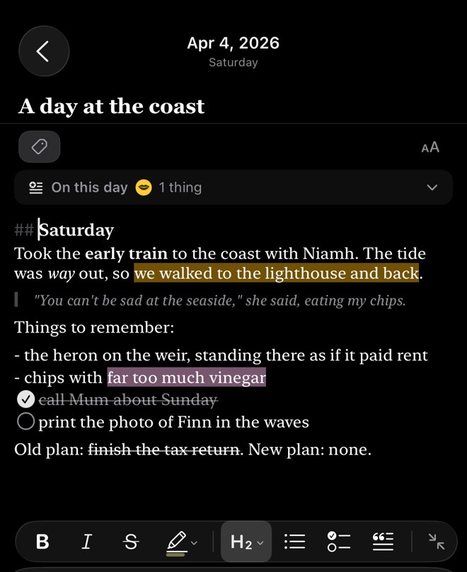
Most of the work was teaching the editor when to do nothing. 5 * 3 * 2 is arithmetic, not emphasis. snake_case_name should not lean. One Return starts a new paragraph, the way it does on paper.
There is a bar above the keyboard for when you would rather tap than type: bold, italic, strikethrough, highlights in five colours, headings, lists, tasks and quotes.
Underneath, the entry is still the kind of text Gruber had in mind. A highlight is saved as ==like this==, which Obsidian reads too, and what you bring in from Day One or Diarly keeps its shape.
The asterisks are still there. You just don’t have to look at them.